Overview
Due to regulations governing what must be included, a bank’s website can run to thousands of pages long. But that doesn’t mean it can’t be enticing and easy to navigate. Having undergone an extensive rebranding process, Bank Discount wanted to up its game on all of its marketing websites, improving the user experience and attracting new customers. Aman Digital was happy to help.
The Challenge
Oftentimes, a business gets really excited about its new website, investing long hours and bringing in all the right experts to optimize every element. Once it’s up and running, the developer steps out of the picture leaving the client to make changes on the fly, as the need arises. Additional content and features that are added may not conform to the original plan, the visual language ceases to be unified, and the website can lose its focus, becoming hard to use.
This was the case with Bank Discount. Existing and potential customers visiting the site could easily get lost, unable to find what they were looking for. What’s more, the internal team responsible for adding new content to the website found it difficult to action updates in a consistent way. A solution needed to be found to make the site more accessible for both types of stakeholders.

A fresh start
Following a successful proof of concept, Aman Digital was selected to be the developer for the project. The brief was flexible, but centered around the creation of a system of components that could be applied not only to the Bank’s main website, but to various ‘satellite’ sites – for pensioners, open banking, personal banking, business banking, private banking, investor relations and Mercantile Bank.
Beginning from zero, Aman embarked on extensive research, getting to know the different websites – their respective objectives, the needs of the intended audiences, and the functionalities required for each one. This enabled the team to assess the type of content and specific components that would be needed across the board. A survey was also carried out of banks in Israel and overseas, both traditional and digital, to understand the market and how to present content in this sector. A checklist was then compiled to be used as the basis for all the websites included in the project.
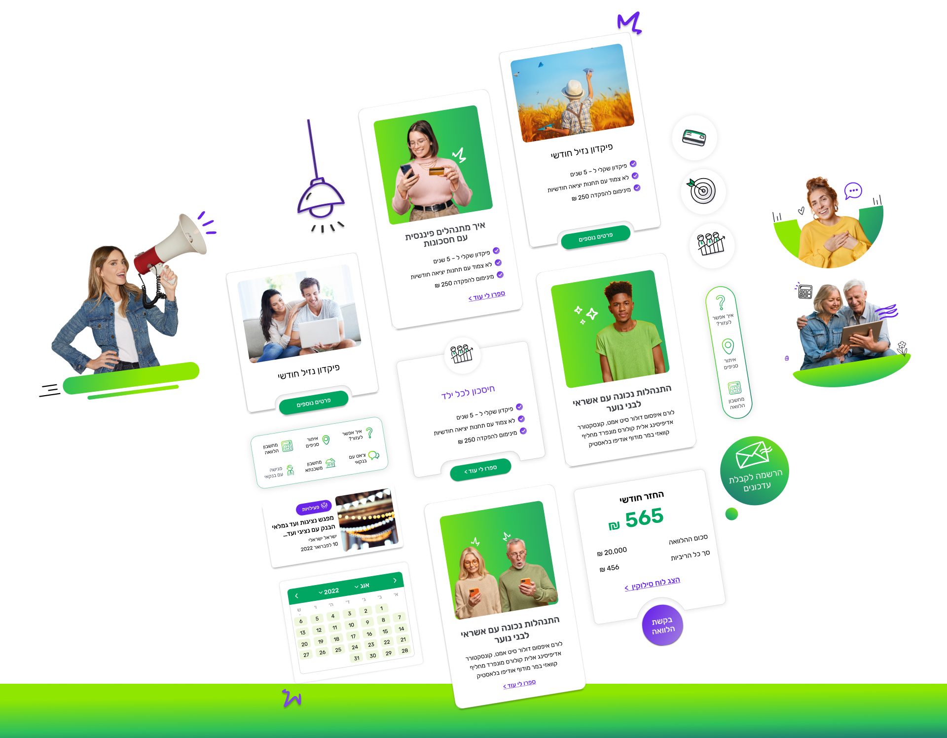
It became clear that what was required was clean, consistent graphics; user-friendly features such as descriptive headings, bullets, highlights of longer pages of content, simple navigation and intuitive categories; and value-added elements, such as a loan calculator and glossary of terms. All this was to be achieved in a smart, flexible website that reflected the Bank’s new branding, and would still be compliant with the stringent rules and regulations that apply to websites of financial institutions.
Checking all the boxes
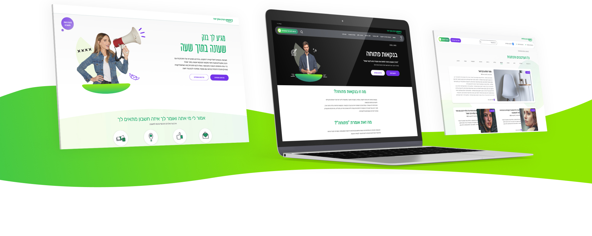
Armed with its comprehensive checklist, Aman embarked on the main marketing website, translating the Bank’s new branding from print to a clean and fresh digital look & feel. The team devised a design system – made up of building blocks with a clear, uniform language – to form the basis of all the components of the various websites. These smart components have a uniform grid, enabling webpages to be altered as the needs of the Bank change, while still adhering to the design guidelines to ensure consistency between the sites.
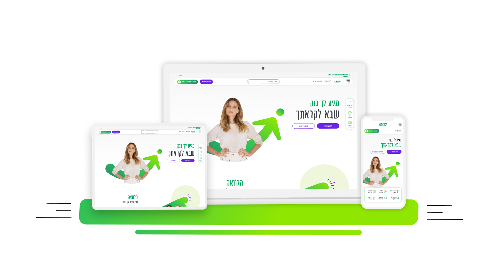
Specifically, the new design comprises a modern, colorful font, complemented by plenty of white space to create a visual experience that is bold, attractive and easy on the eye.
As well as the aesthetics of the site, a lot of attention was paid to making the user experience more comfortable and intuitive. This was achieved in a number of ways.
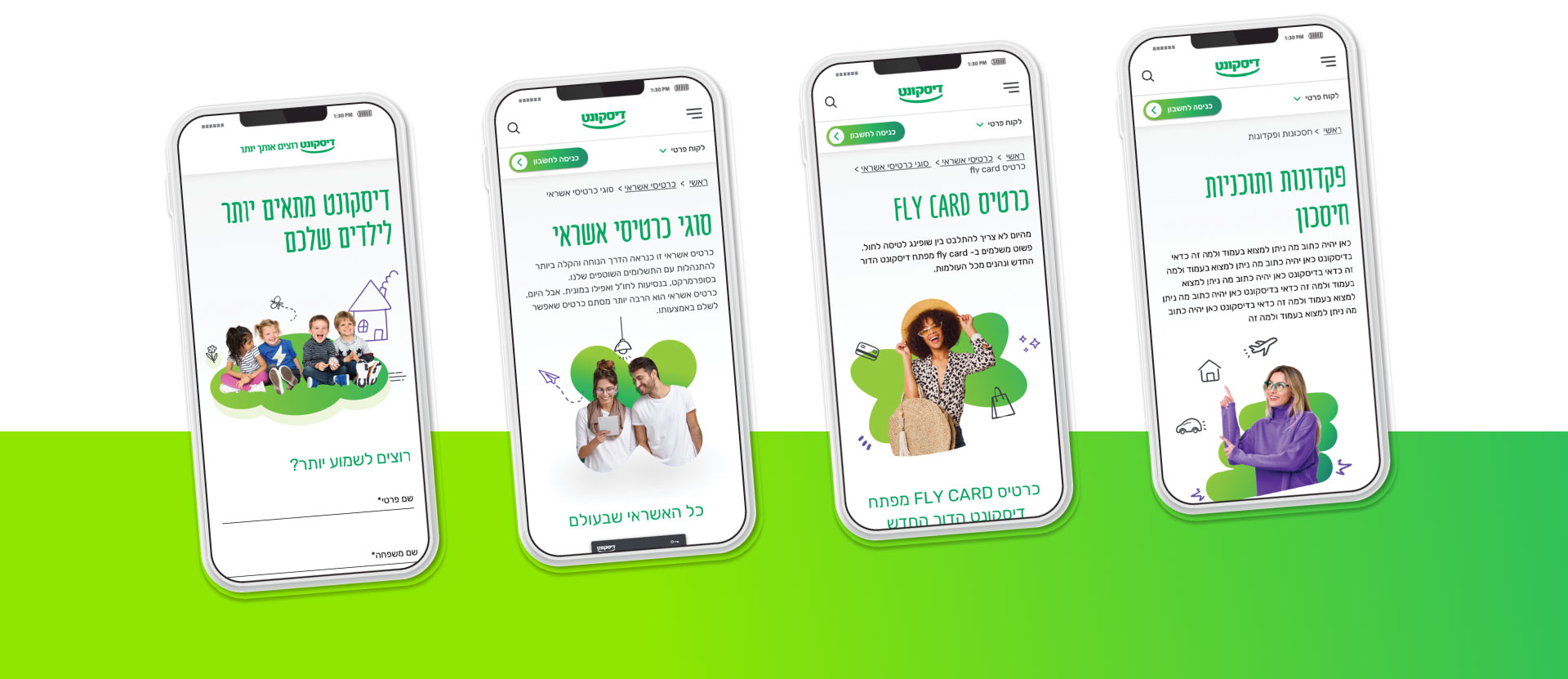
Throughout the website, content is written in a unified language, and kept brief and focused. Navigation has been simplified by a single hierarchy menu that enables site visitors to easily search for – and find – specific information, and switch between sections of the site. Navigation solutions were also created for complex or long pages, using anchors or inner tabs. Smart user-centered filtering enables visitors to find the information or product they are looking for right away, while a new ‘how can I help?’ button on the Home page enables users to easily access FAQs, a branch locator and contact information for different branches.
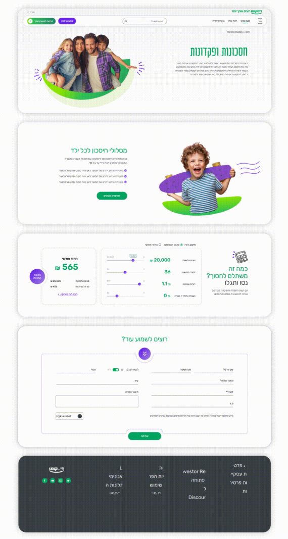
Highlights have been introduced to pull out key details that are covered on a given page, list the benefits of a specific offering, illustrate processes in a simple way, or provide additional details to complement how products are described and presented in the content pages. New graphic elements and videos catch the eye and deliver the Bank’s messaging visually and, where relevant, tools such as loan and pension calculators also add value.
A new ‘how can I help?’ button on the Home page enables users to access FAQs, a branch locator and contact information for different branches. Pages are responsive to all types and sizes of screen – tablets, mobile and desktop – for a unified experience no matter how the visitor chooses to access the site, and the needs of older or visually impaired customers have also been taken into account when setting the size of buttons and text.
Behind the scenes
For the Bank’s digital team, Aman adapted all webpages to the Umbraco content management system, which enables the construction of dynamic layouts with easy-to-use drag-and-drop components. For future use, templates were created for different types of pages – lobby, informative and marketing – incorporating all the relevant components to enable flexibility, while maintaining a constant grid.
Aman provided numerous examples to illustrate the optimal way to present components, with a clean UI and UX that is easy to use, along with strategic guidance about how to lay out a page, what type of information to include – and how much – the ideal color and size of fonts, language etc. This gives the Bank’s team the freedom they need to add or change pages down the line, while ensuring that the same clean visuals will be maintained as those created by Aman.
Onwards and upwards
Having successfully completed the Bank’s main website, Aman is now in the process of creating the six seven additional sites – for pensioners, open banking, personal banking, business banking, private banking, investor relations and Mercantile Bank ,– all with the same language, look & feel -, albeit expressed in a slightly different way, so that it isthey are all instantly recognizable as Bank Discount.
Style guides have been created for all sub-brands, covering the grid, colors, fonts, different languages, types of modes, tabs, etc.